

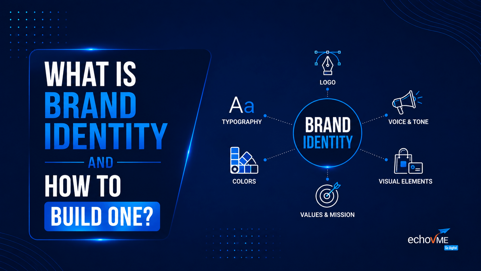
A step-by-step guide from the team at echoVME Digital, built from brand identities we’ve actually designed
Brand identity is the complete set of visual, verbal, and experiential elements, including a company’s name, logo, colour palette, typography, tone of voice, and brand story, that it controls to shape how customers perceive the business.
It differs from brand image, which reflects how people actually perceive the brand, and from branding, the continuous process of building and strengthening that identity. Industry research consistently shows that companies with cohesive brand identities are approximately 3 to 4 times more recognizable, while maintaining a consistent brand presentation has been linked to revenue increases of up to 23%.
At echoVME, we’ve built brand identities for clients across jewellery, healthcare, real estate, and D2C for over a decade, and this guide walks through exactly how we do it.
echoVME Digital’s team has sat across the table from founders who thought “brand identity” meant picking a nice logo and a font from Canva. We’ve also sat with clients who had a beautiful visual identity but no clarity on what their brand actually stood for, which is just as big a problem.
Over more than a decade of building digital brands for clients, we’ve learned that brand identity is one of the most misunderstood terms in marketing, and also one of the highest-leverage things a business can get right early. This guide breaks down exactly what brand identity is, why it matters, and how we build one, step by step, with real examples along the way.
What Is Brand Identity?
Brand identity is the complete collection of visual, verbal, and experiential elements that a company deliberately creates and controls to represent itself to the world. That includes the name, logo, colour palette, typography, tone of voice, imagery style, tagline, packaging, and the overall story the brand tells.
In simple terms: brand identity is everything the brand puts out, the outfit it chooses to wear every single day, across every touchpoint, from its website to its Instagram grid to the way its support team replies to a customer complaint.
What brand identity is not: it isn’t your logo alone, it isn’t your tagline alone, and it isn’t the same as how customers actually feel about you. It’s the deliberate, designed input. What customers take away from it is a separate (though related) thing called brand image.
Brand Identity vs Brand Image vs Branding vs Brand Strategy
These four terms get used interchangeably, and that confusion causes real strategic mistakes. Here’s how we explain the difference to every client at the start of a branding engagement:
| Term | What It Actually Means |
| Brand Identity | What the company controls and creates: name, logo, colours, typography, tone, story. |
| Brand Image | How the audience actually perceives the brand, shaped by identity but not fully controllable. |
| Branding | The ongoing process and activities used to build, manage, and evolve brand identity over time. |
| Brand Strategy | The long-term plan behind the brand positioning, target audience, and business goals that identity is built to express. |
In short: brand strategy decides what the brand should stand for, brand identity is how that gets designed and expressed, branding is the ongoing work of applying it everywhere, and brand image is the result of what actually lands in the customer’s head. You can control the first three. The fourth, you can only influence.
Why Brand Identity Matters
Brand identity isn’t a design exercise; it’s a business lever, and the data backs this up consistently across independent studies:
1. Consistency compounds recall.
Multiple industry studies on brand consistency report that companies presenting their identity uniformly across platforms are roughly 3 to 4 times more visible to their audience than those that don’t.
2. Consistency drives measurable revenue.
Research on brand consistency has repeatedly linked disciplined, uniform brand presentation to revenue increases of up to 23%, with a large share of companies attributing 10-20% of their revenue growth directly to consistency.
3. Recognition is earned slowly, and lost quickly.
It typically takes 5 to 7 repeated impressions before a new brand becomes memorable to a consumer; a weak or shifting identity resets that clock every time it changes.
4. Colour and design shortcut trust
A recognisable colour palette alone can improve brand recognition by a meaningful margin, which is why the strongest brands protect their visual system as tightly as they protect their name.
We’ve seen this play out directly with our own clients. A brand with a clear, consistent identity spends less to be remembered; every campaign, post, and packaging update reinforces the previous one rather than starting from scratch.
The Core Elements of Brand Identity
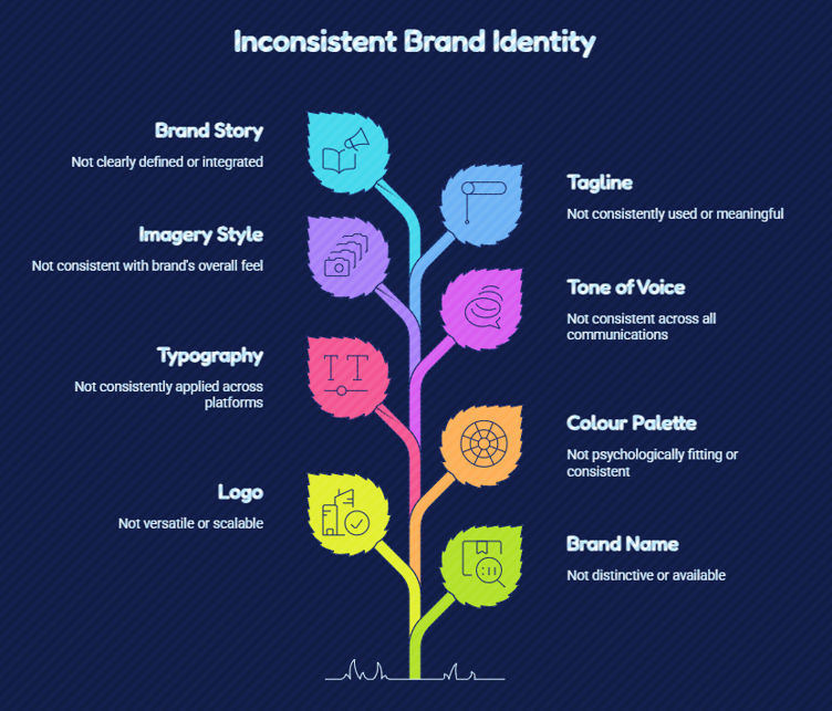
Brand name. Short, distinctive, easy to say and spell and ideally available as a domain and handle.
Logo. The visual mark, but never the whole identity on its own. Should work in a single colour and at small sizes (favicon-size is our test).
Colour palette. A primary and secondary set of colours used consistently everywhere, chosen for psychological fit with the brand’s category and audience, not just personal taste.
Typography. The fonts used across web, print, and packaging one for headlines, one for body copy, applied without exception.
Tone of voice. How the brand “talks” formal or casual, playful or authoritative kept consistent across ads, social captions, and customer service replies.
Imagery style. The style of photography, illustration, or video the brand uses moody and cinematic versus bright and candid, for example.
Tagline. A short line capturing the brand’s promise, used sparingly but consistently, not changed every campaign.
Brand story. The narrative of why the brand exists — origin, mission, and the problem it was built to solve that gives every other element meaning.
Real Examples of Strong Brand Identity
Abstract principles are easier to apply with real reference points, so here are examples we regularly point to with clients:
Amul
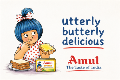
Amul has run one of India’s most consistent brand identities for decades the same mascot, the same topical cartoon format, and the same conversational, witty tone across generations of campaigns. The identity barely changed while the country around it transformed completely, which is precisely why it’s still instantly recognisable.
Zomato
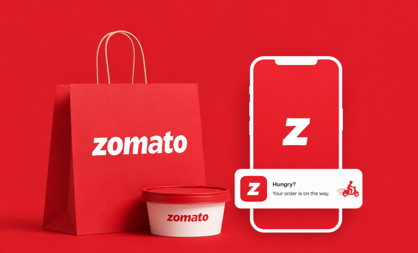
Zomato built a brand identity around a bold, red-and-white visual system and a distinctly witty, meme-literate tone of voice that carries through its app, its social captions, and even its order notifications. The consistency of that voice across every touchpoint is what makes the brand feel like a personality rather than a food delivery utility.
Tanishq

Tanishq has built its identity around heritage craftsmanship, warm gold and maroon tones, and storytelling that centres real Indian families and moments, differentiating it clearly from mass-market jewellery retailers on trust and tradition rather than price.
Apple
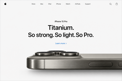
Apple’s identity is built on radical minimalism — clean typography, generous white space, and a restrained, confident tone of voice used identically whether you’re reading a product page or a keynote invite. Every touchpoint reinforces the same idea: simplicity as premium.
Nike

Nike’s identity centres on a single symbol, the swoosh, paired with a consistently motivational, athlete-first tone across every campaign. The identity is so disciplined that the brand can run ads with almost no logo visibility and still be instantly recognised.
The pattern across all five: none of them are just a logo. Each one is a fully designed system — visual and verbal applied without deviation across every single touchpoint.
How We Build Brand Identity
We did not arrive at this process by reading a textbook, it’s the sequence we’ve refined across real client engagements, including luxury jewellery brands, healthcare providers, and D2C launches. Here’s how we approach it:
Step 1: Strategy before design.
Before we open a design tool, we run discovery sessions to understand the business goals, the competitive landscape, and critically who the brand is actually trying to reach. A brand identity built without this step looks nice and does nothing.
Step 2: Define positioning.
We map three to five words the brand should own in a customer’s mind. For a premium jewellery client of ours, that meant words like heritage, craftsmanship, and trust every subsequent design decision had to serve those words.
Step 3: Build the visual system.
Colour, typography, and imagery are chosen to express the positioning, not personal preference. For JCS Jewel Creations, a premium jewellery boutique we work with in Chennai, this meant a palette and photography style that felt luxurious and warm rather than cold and transactional translating decades of craftsmanship into a visual language that reads as premium at first glance.
Step 4: Codify the tone of voice.
We define how the brand should sound in a product description versus a customer service reply versus an Instagram caption because inconsistency here is just as damaging as inconsistent colours.
Step 5: Apply it everywhere, consistently.
A brand identity is only as strong as its least consistent touchpoint. We build out guidelines and apply them across website, social, packaging, and ad creative so nothing ships off-brand.
Step 6: Evolve, don’t reinvent every year.
We treat brand identity as a living system, not a one-time deliverable, reviewing it periodically as the brand grows, without changing it so often that it never has the chance to become recognisable.
Common Mistakes That Weaken Brand Identity
- Changing colours, fonts, or tone across different platforms confuses audiences and resets the recognition clock every time.
- A striking logo cannot compensate for a brand with no clear positioning or story behind it.
- A generic name, palette, or tone that could belong to any competitor fails the single most important job of an identity: standing out.
Copying trending colour palettes or design styles without checking if they actually fit the brand’s positioning or audience. - Rebranding out of boredom rather than strategic need, which sacrifices years of built-up recognition.
How to Know If Your Brand Identity Is Working
- Could someone recognise your brand from a single visual element (colour, logo shape, or font) with the name covered?
- If you handed your brand guidelines to three different designers, would they all sound and look the same?
- Does every touchpoint website, packaging, social, customer service feel like it belongs to the same brand?
- Can your team describe what the brand stands for in one sentence, consistently, without checking notes?
- If the answer to any of these is no, that’s usually the starting point of a brand identity engagement, not a full rebrand.
This process reflects how echoVME itself has grown. Sorav Jain, our Founder & CEO, has spent 18+ years building brands in India’s digital marketing industry, growing echoVME from a Chennai-based startup in 2011 into a 150+ member agency serving 300+ brands, while also founding Digital Scholar, India’s agency-style digital marketing training institute. The brand identity framework in this guide is the same one our strategists apply on client engagements every week refined through real campaigns, not adapted from a generic template.
FAQs Related To Brand Identity & How to Build One
What is brand identity in simple words?
Brand identity is the complete set of visual and verbal elements name, logo, colours, typography, tone of voice, and story that a company deliberately creates to represent itself to its audience.
What is the difference between brand identity and brand image?
Brand identity is what the company designs and controls. Brand image is how the audience actually perceives the brand as a result shaped by identity but not fully controllable.
How long does it take to build a brand identity?
A focused brand identity project typically takes 4-8 weeks, covering discovery, positioning, visual system design, and guideline documentation, though timelines vary with brand complexity and stakeholder rounds.
Do small businesses need a formal brand identity?
Yes. Even a simple, consistent colour palette, tone of voice, and logo applied uniformly gives small businesses stronger recall and trust than an inconsistent presentation, regardless of budget size.
What are the core elements of brand identity?
Name, logo, colour palette, typography, tone of voice, imagery style, tagline, and brand story make up the core elements, applied consistently across every customer touchpoint.
How often should a brand refresh its identity?
Most brands benefit from periodic refinement every 7-10 years rather than frequent overhauls, since recognition is built through repetition, changing identity too often resets that recognition.
Can a logo alone be a brand identity?
No. A logo is one visual element within a brand identity, not the whole system. Colour, typography, tone of voice, and story all need to work together for an identity to be effective.
Why is brand consistency important?
Consistent brand presentation is linked to significantly higher recall and visibility, and industry research repeatedly connects it to measurable revenue growth, since audiences trust what feels familiar and reliable.
What comes first: brand strategy or brand identity?
Brand strategy comes first. It defines positioning, audience, and business goals; brand identity is then designed to visually and verbally express that strategy.
How does echoVME approach brand identity projects?
We start with strategy and positioning before any design work, then build the visual system and tone of voice around it, and apply both consistently across every touchpoint the brand owns.
Conclusion
A strong brand identity is not created by choosing a logo, colour palette, or font in isolation. It comes from knowing what the brand stands for, who it needs to connect with, and how every visual and verbal detail can reinforce that position over time.
The brands people remember are not necessarily the loudest; they are the ones that show up consistently, clearly, and recognisably across every touchpoint. Whether you are building a new brand from the ground up or questioning whether your current identity still reflects where the business is headed, the right starting point is strategy before design.
Thinking through a brand identity project or a refresh that’s overdue? That’s exactly the kind of work our strategy and design team at echoVME does end to end. Get in touch with us to talk through where your brand stands today.
